| Date |
Location |
Name |
Insert (Outside) |
Insert (Inside) |
Tray |
Disc 1 |
Disc 2 |
Inside Tray |
Booklet
(pages 3 & 6) |
Booklet
(pages 4 & 5) |
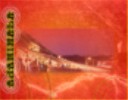
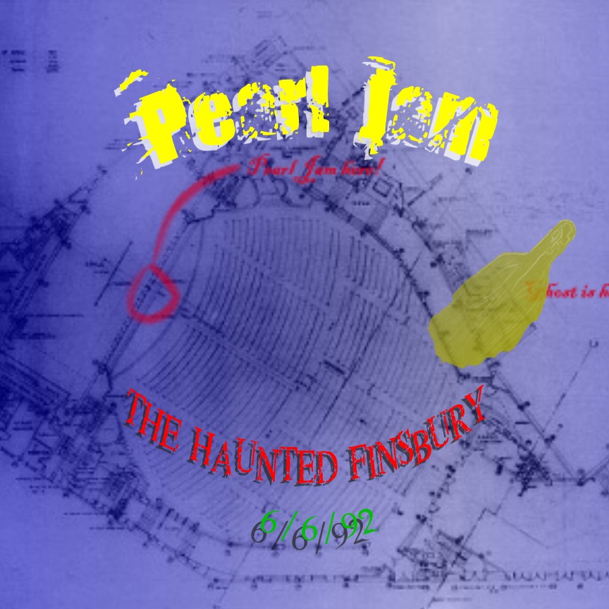
| 06/06/92 |
London, England |
"The Haunted Finsbury" |
 300 dpi (370k) 300 dpi (370k) |
 300 dpi (272k) 300 dpi (272k) |
 300 dpi (170k) 300 dpi (170k) |
 300 dpi (139k) 300 dpi (139k) |
|
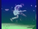
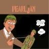
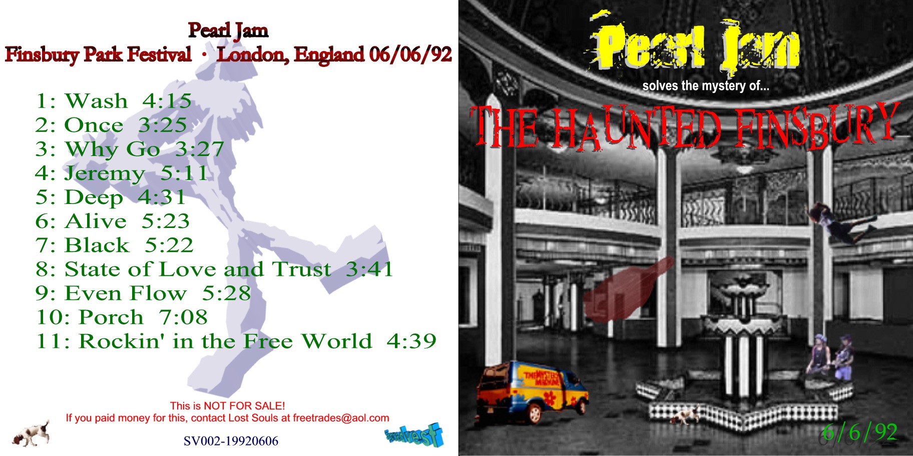
Comments: The title and theme of this one has nothing to do with the show itself. This was basically the first complete version of this show that Olivier put together...so I thought about how elusive this was, and after looking at some old pics around
Finsbury Park, I thought it looked kind of creepy, and so the "Haunted Finsbury" came to mind. Looking back at it now, it is kind of goofy, just some photo manipulation (and not too good at that) where PJ is reenacting a Scooby Doo cartoon , but I still kind of like it...
Completed: April 2001 |
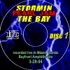
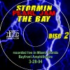
| 03/28/94 |
Miami, FL |
"Stormin' the Bay" |
 300 dpi (xk) 300 dpi (xk) |
 300 dpi (xk) 300 dpi (xk) |
 300 dpi (xk) 300 dpi (xk) |
 300 dpi (xk) 300 dpi (xk) |
 300 dpi (xk) 300 dpi (xk) |
 300 dpi (xk) 300 dpi (xk) |
Comments:
Completed: |
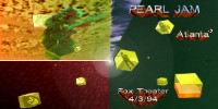
| 04/03/94 |
Atlanta, GA |
"Atlanta3" |
 300 dpi (xk) 300 dpi (xk) |
 300 dpi (xk) 300 dpi (xk) |
 300 dpi (xk) 300 dpi (xk) |
 300 dpi (xk) 300 dpi (xk) |
 300 dpi (xk) 300 dpi (xk) |
 300 dpi (xk) 300 dpi (xk) |
 300 dpi (xk) 300 dpi (xk) |
 300 dpi (xk) 300 dpi (xk) |
Comments:
Completed: |
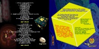
| 06/20/95 |
Morrison, CO |
"AJAMIMALA" |
 300 dpi (639k) 300 dpi (639k) |
 300 dpi (516k) 300 dpi (516k) |
 300 dpi (542k) 300 dpi (542k) |
 300 dpi (516k) 300 dpi (516k) |
 300 dpi (313k) 300 dpi (313k) |
 300 dpi (346k) 300 dpi (346k) |
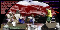
Comments: I worked on this for a year, off and on, where I tried to do something as psychedelic as I could. I was told by Dave P. of this mixing project well beforehand, but I kept shelving it as I did other things. The title is a spin-off of the title of the Grateful Dead album "AOXOMOXOA". I actually had to reduce the sharpness of the mushroom models because during the conversion it kept crashing my machine because the files were so large. For the inside booklet, I colorized
the famous soundcheck picture, and it turned out to be a much bigger task than I originally thought. And to further complicate matters, as I was working on this near the end, I accidentially erased my harddrive, losing some of my work. :(
Completed: July 2002 |
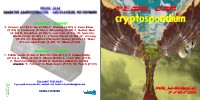
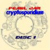
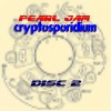
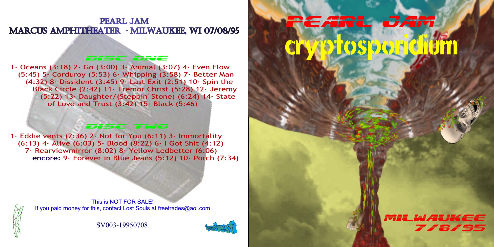
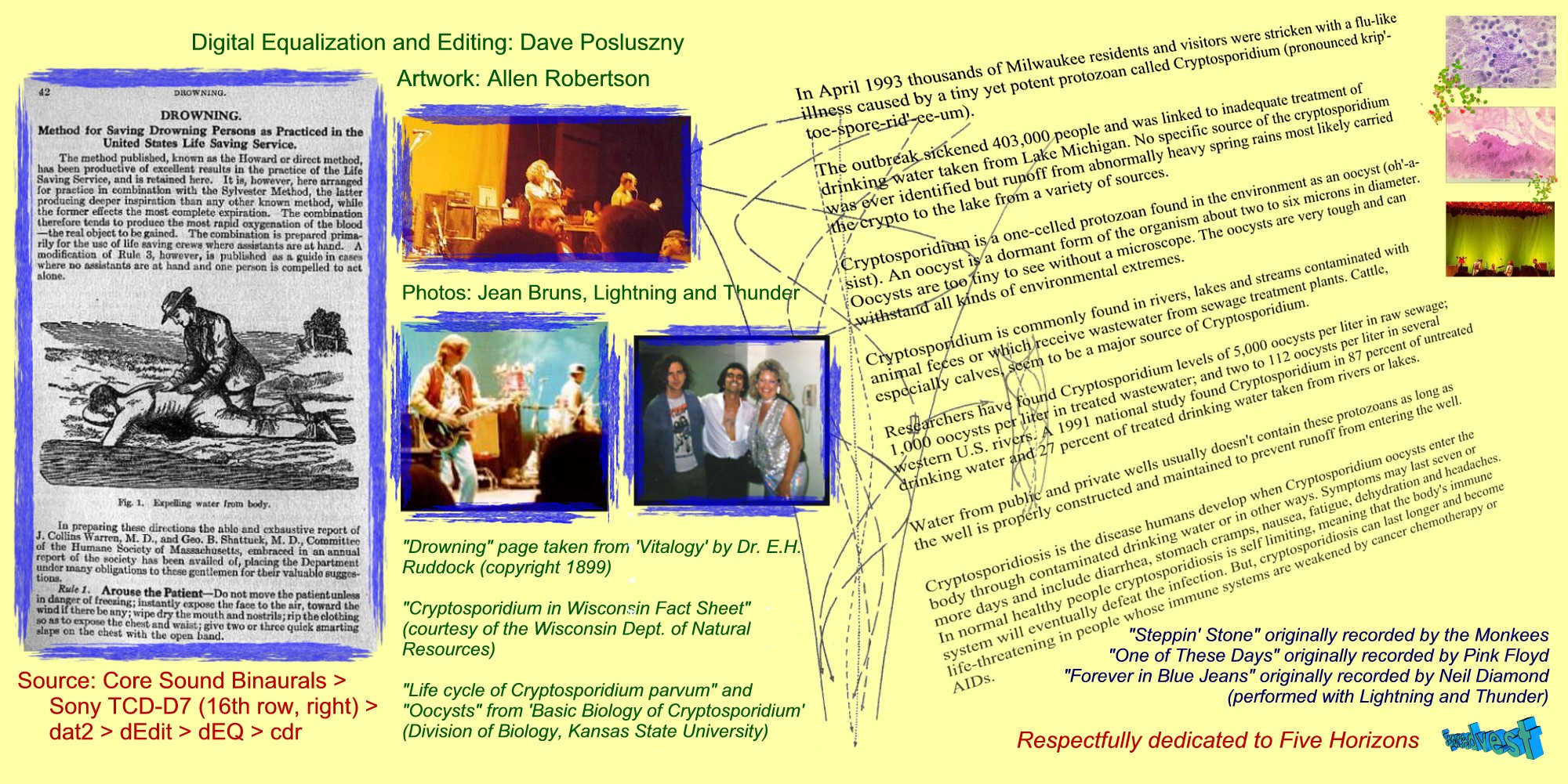
| 07/08/95 |
Milwaukee, WI |
"Cryptosporidium" |
 300 dpi (393k) 300 dpi (393k) |
 300 dpi (664k) 300 dpi (664k) |
 300 dpi (389k) 300 dpi (389k) |
 300 dpi (280k) 300 dpi (280k) |
 300 dpi (280k) 300 dpi (280k) |
Comments: This is one of my favorites, I really like how the cover of the insert turned out. Basically just did some research on cryptosporidium and used the data that I could find...kind of like a PBS Special. :)
Completed: May 2001
Modified: Dec. 2001 (touched up the insert cover just a tad and added the Lightning and Thunder pic). |
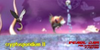
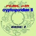
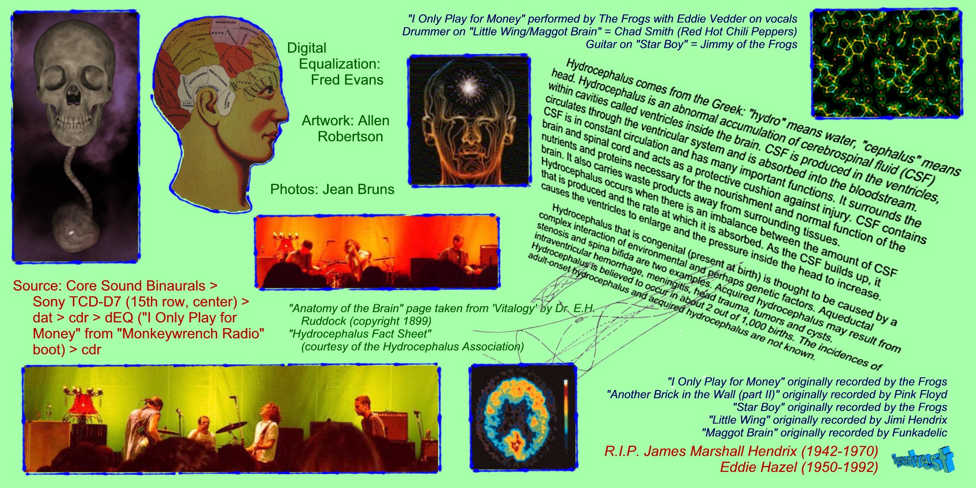
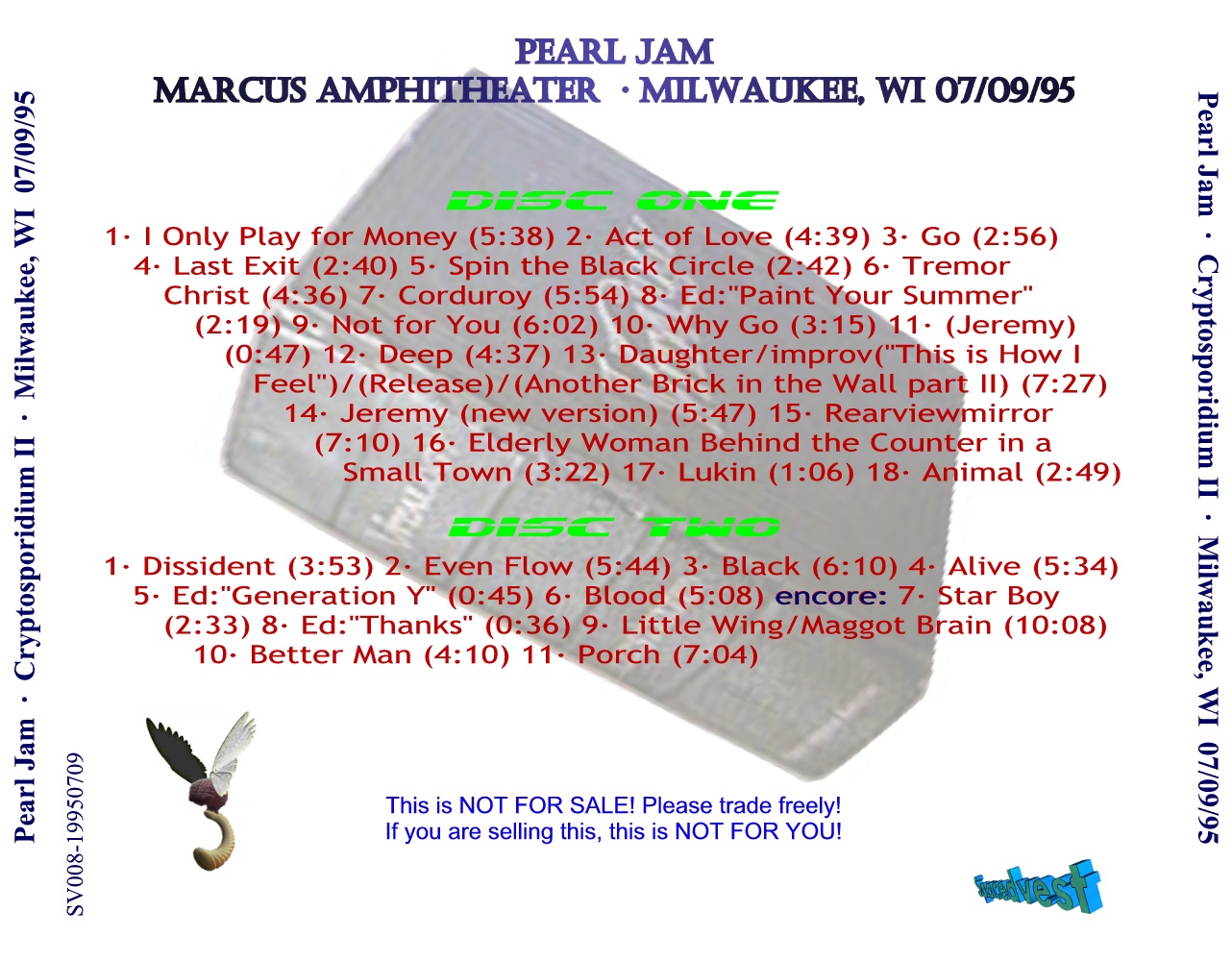
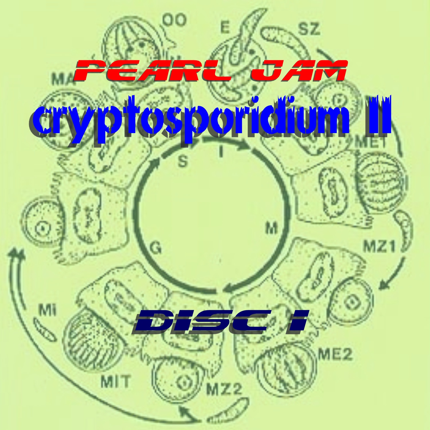
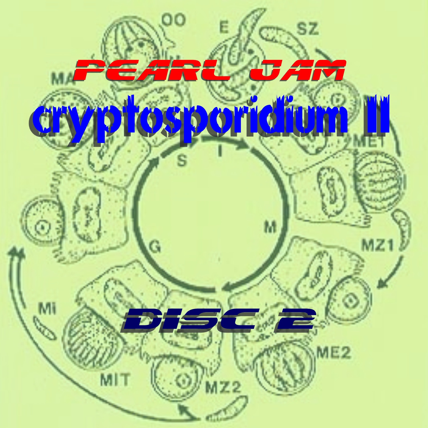
| 07/09/95 |
Milwaukee, WI |
"Cryptosporidium II: Maggot Brain" |
 300 dpi (562k) 300 dpi (562k) |
 300 dpi (599k) 300 dpi (599k) |
 300 dpi (408k) 300 dpi (408k) |
 300 dpi (453k) 300 dpi (453k) |
 300 dpi (454k) 300 dpi (454k) |
Comments: Another one mostly done with modeling. I spent a lot of time on the fish and on the "Flying Maggot Brain". I went back to the "water is deadly" theme per Crypto I (that is why the fish are flying and not in the water) and combined it with a "brain" theme. The raytracing on the rendering took about 20 hours of CPU time.
Completed: Dec. 2001
Modified: Mar. 2002 (changed the wings on Mr. Maggot Brain). |
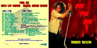
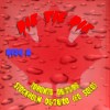
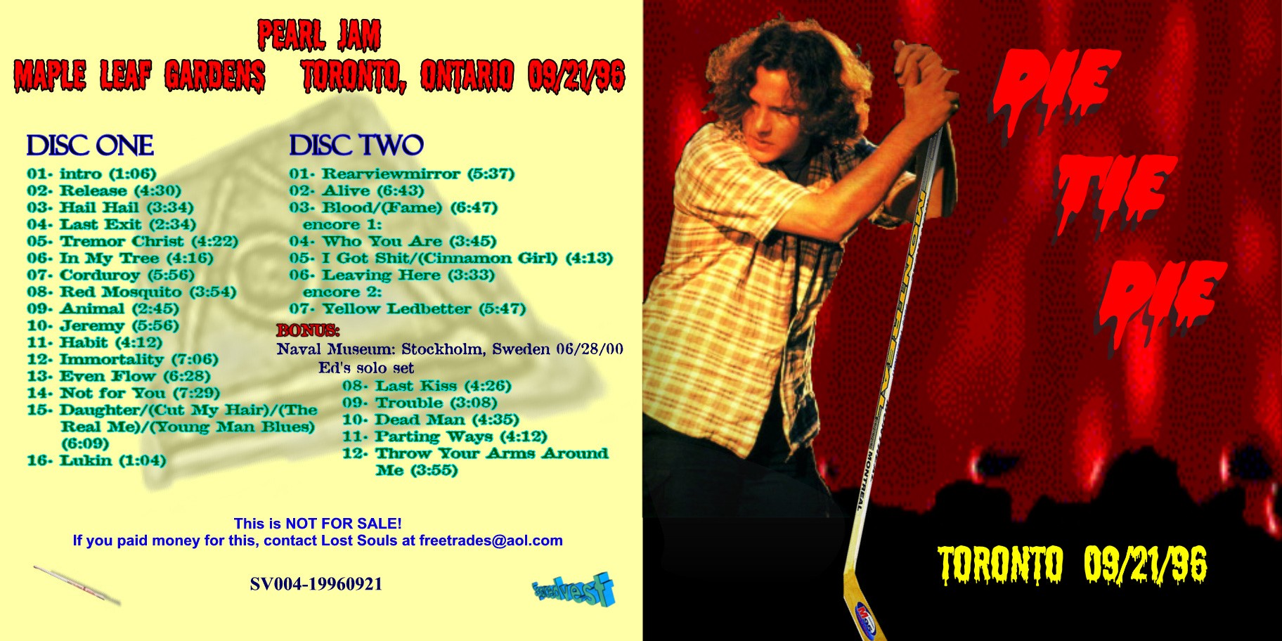
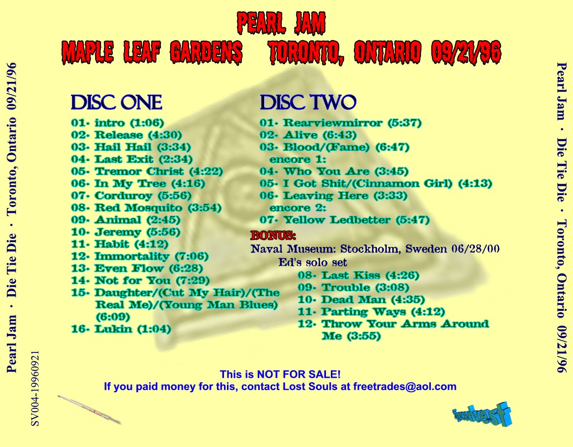
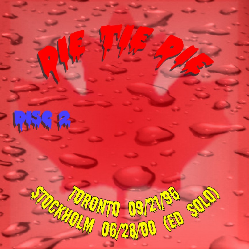
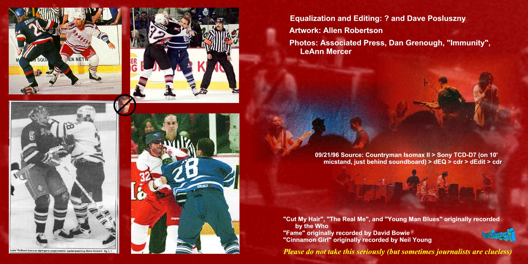
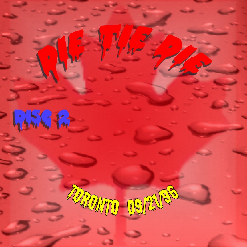
| 09/21/96 and 06/28/00 preshow |
Toronto, Ontario and Stockholm, Sweden |
"Die Tie Die" |
 300 dpi (394k) 300 dpi (394k) |
 300 dpi (467k) 300 dpi (467k) |
 300 dpi (261k) 300 dpi (261k) |
 300 dpi (117k) 300 dpi (117k) |
 300 dpi (143k) 300 dpi (143k) |
Comments: The title of this one is two things: it is a "play on words" (tie-dye) and also a reference to Tie Domi, the hockey player who normally plays in the building that PJ performed in. The story goes that Domi made a comment about PJ playing in their venue, and a local newspaper reported it, and Ed apparently wasn't
happy with the newspaper's comments (not at Domi himself though). As they decide to take it out on each other, and obviously Domi is going to kick their butts. :) Another one of Dave Posluszny's great editing remastering jobs for the audio, I used a lot of photo manipulation.
Completed: May 2001 |
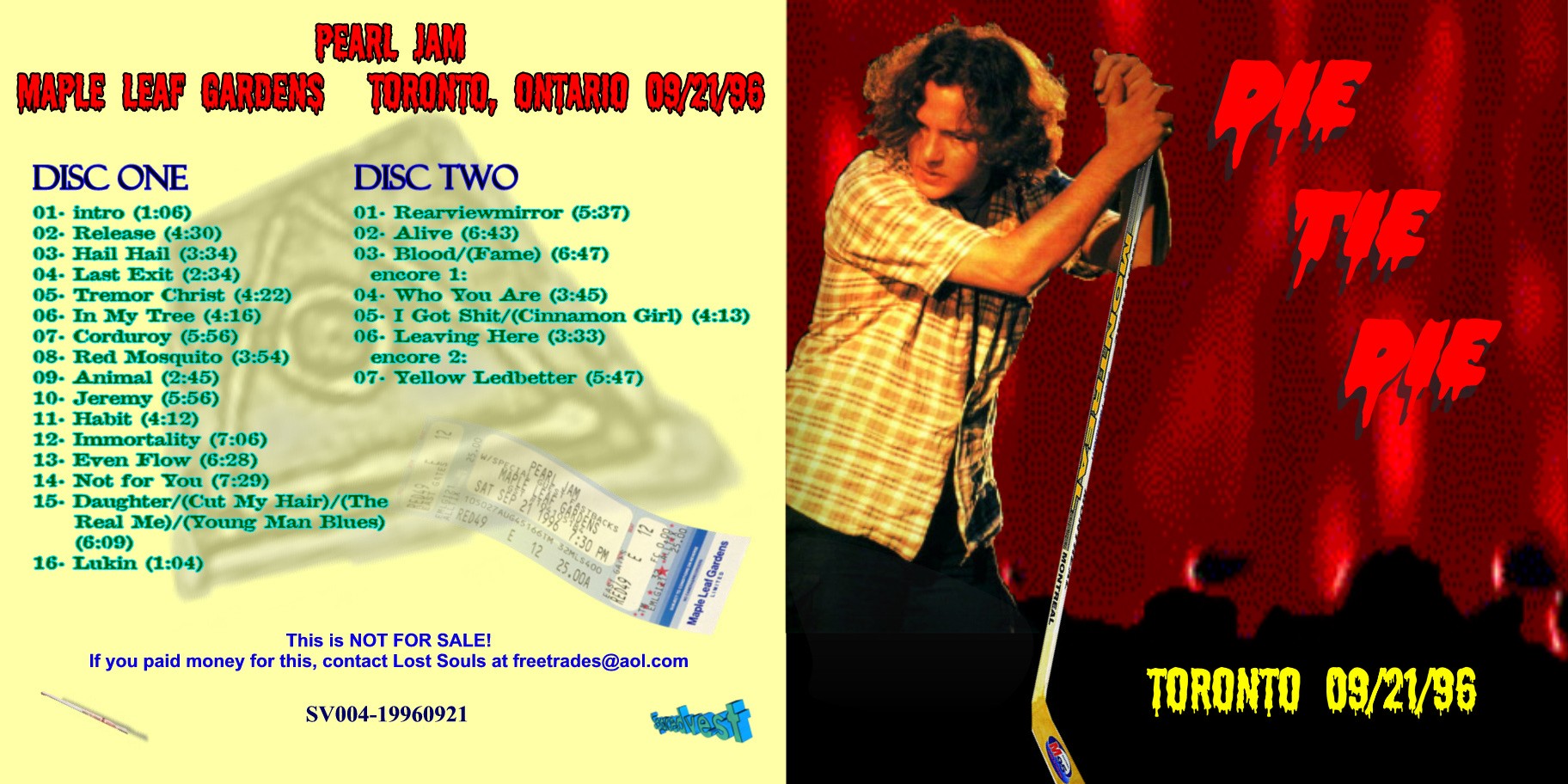
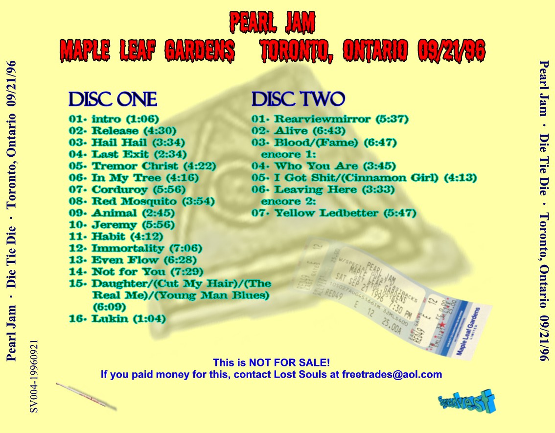
| 09/21/96 |
Toronto, Ontario |
"Die Tie Die" |
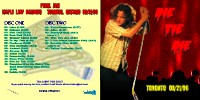 300 dpi (373k) 300 dpi (373k) |
300 dpi (469k) |
 300 dpi (234k) 300 dpi (234k) |
300 dpi (117k) |
 300 dpi (118k) 300 dpi (118k) |
Comments: See above. Just took off the filler for those who do not have it.
Completed: May 2001 |
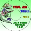
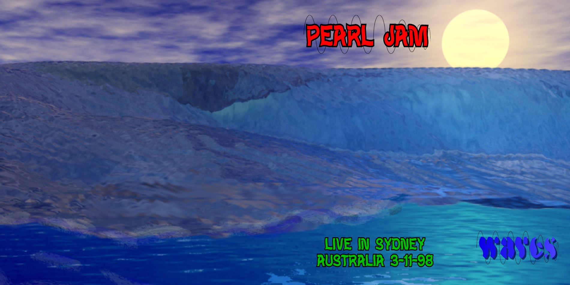
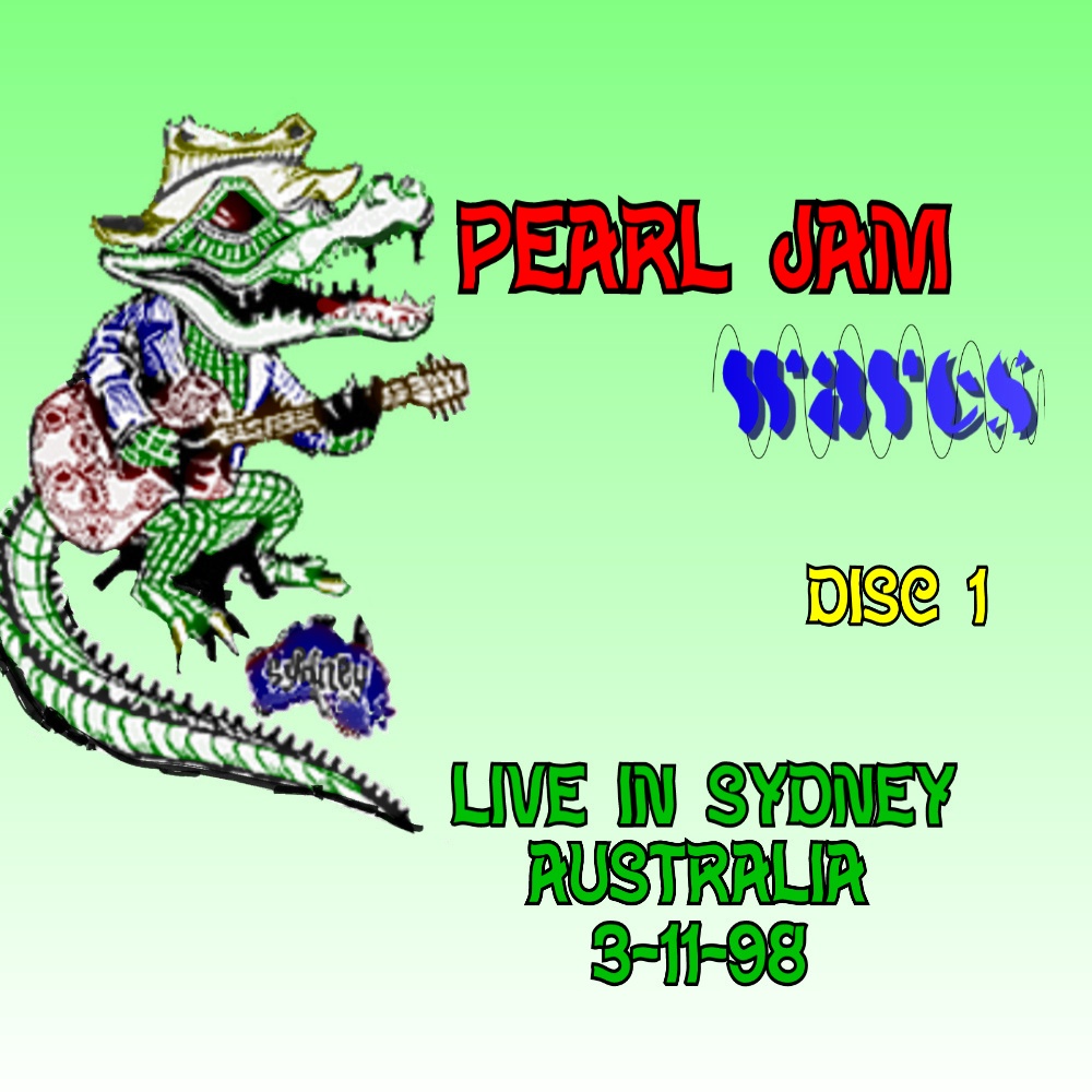
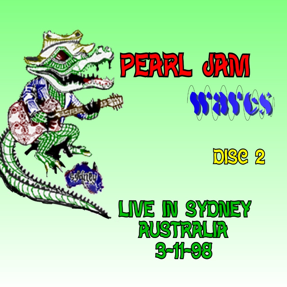
| 03/11/98 |
Sydney, Australia |
"Waves" |
 300 dpi (378k) 300 dpi (378k) |
 300 dpi (674k) 300 dpi (674k) |
 300 dpi (545k) 300 dpi (545k) |
 300 dpi (237k) 300 dpi (237k) |
 300 dpi (237k) 300 dpi (237k) |
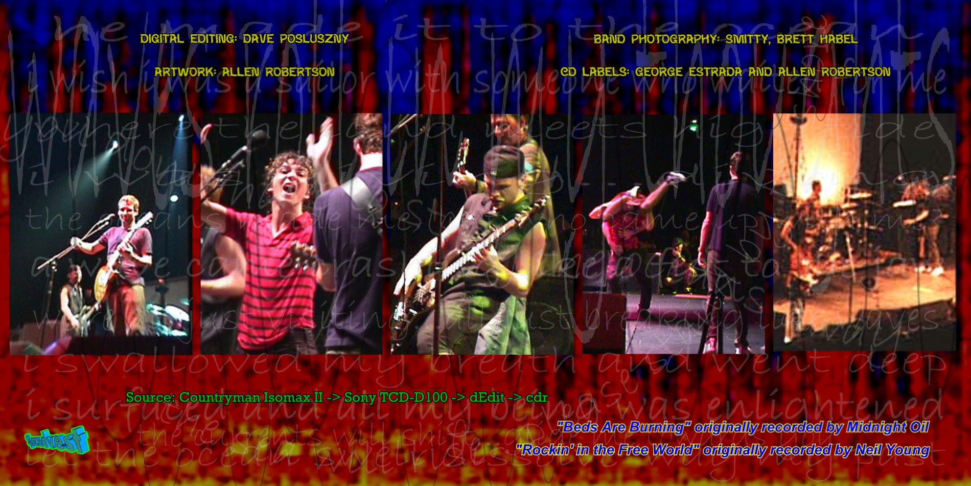
Comments: The interesting thing about this show is the how much the setlist and the references Ed makes are about the ocean, surfing, etc., so I went with that. The inside insert has sample lyrics from all the songs they played where the lyrics were
relevant with this theme. I used Bryce to create the cover, my first one using that program, so that took a little time, and for the labels I colorized the "jamming alligator".
Completed: Mar. 2002 |
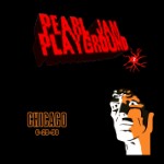
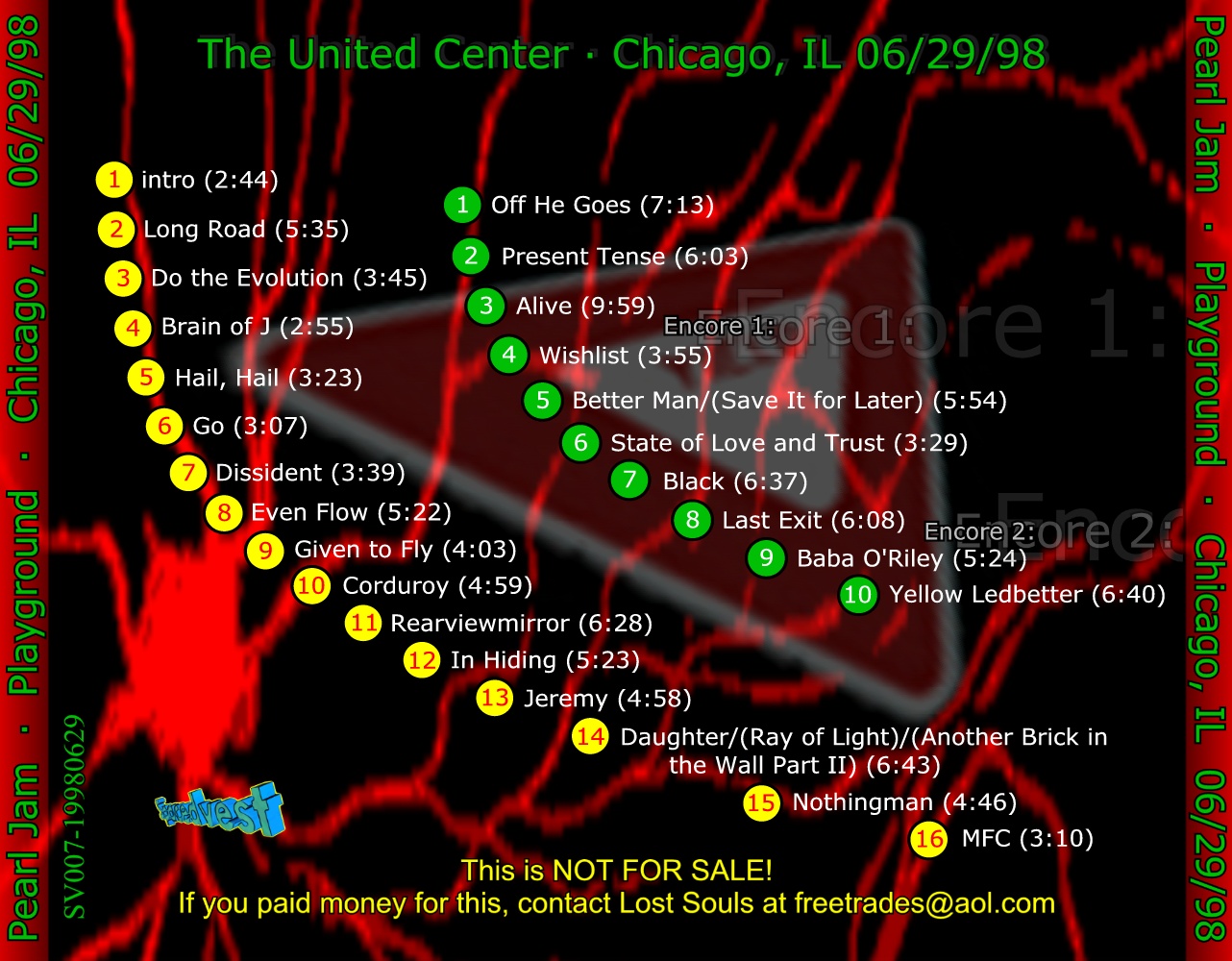
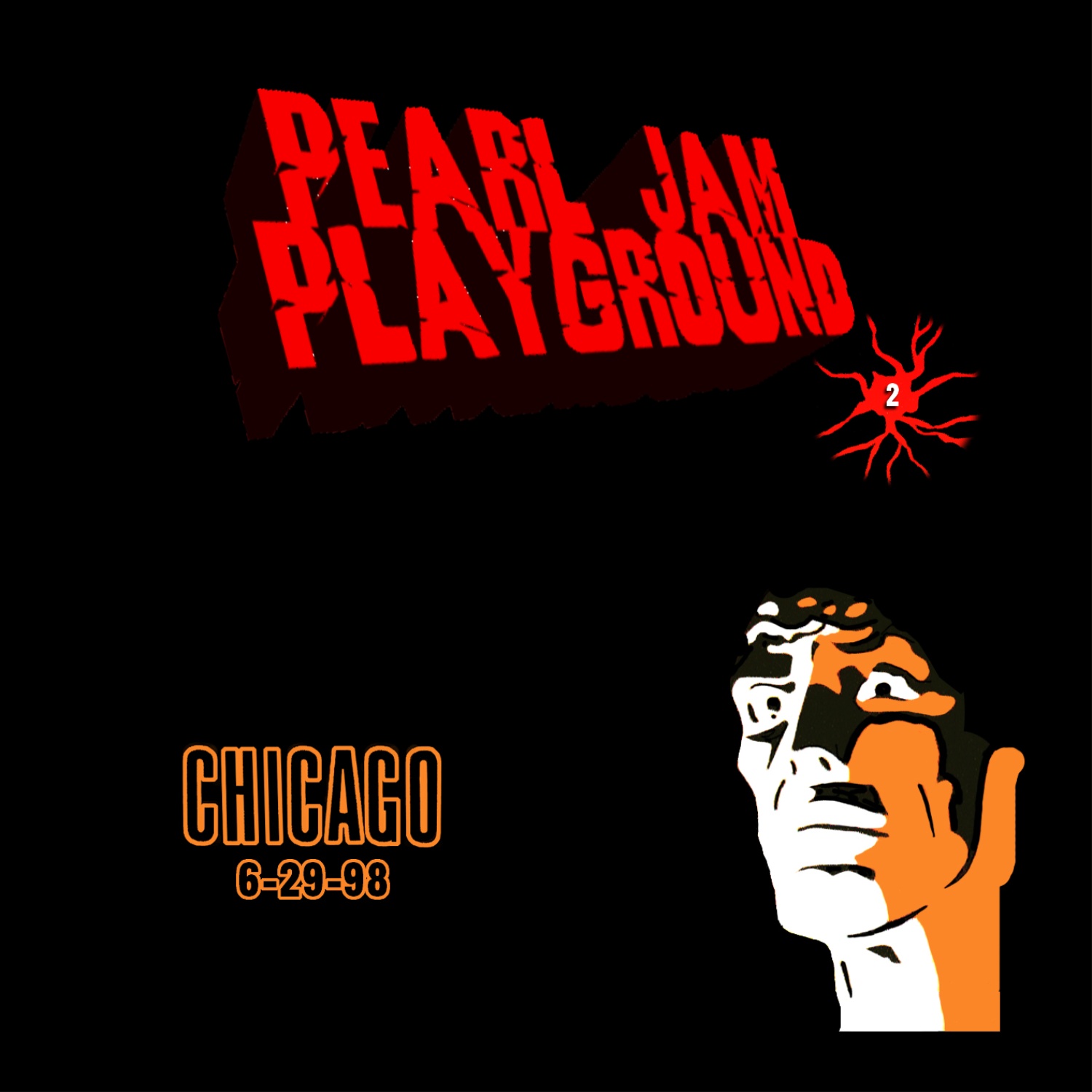
| 06/29/98 |
Chicago, IL |
"Playground" |
 300 dpi (572k) 300 dpi (572k) |
 300 dpi (601k) 300 dpi (601k) |
 300 dpi (405k) 300 dpi (405k) |
 300 dpi (203k) 300 dpi (203k) |
 300 dpi (203k) 300 dpi (203k) |
Comments: I heard about the dEQ'ed versions of this and the 6/30/98 show, and tracking them down through Chris Gratz, he agreed to B&P to me if I made artwork for them and spread them, which I happily agreed. The only criteria he has was that
I do something similar to the posters, since we both already had Jason Warth's cd labels that he did awhile back. I kept changing ideas, at first intending to do like a children's playground for the cover, but thought a simple chessboard would get the point across.
I probably went overboard on the modeling with all the different views, but I like generally how it all turned out.
Completed: Nov. 2001 |
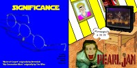
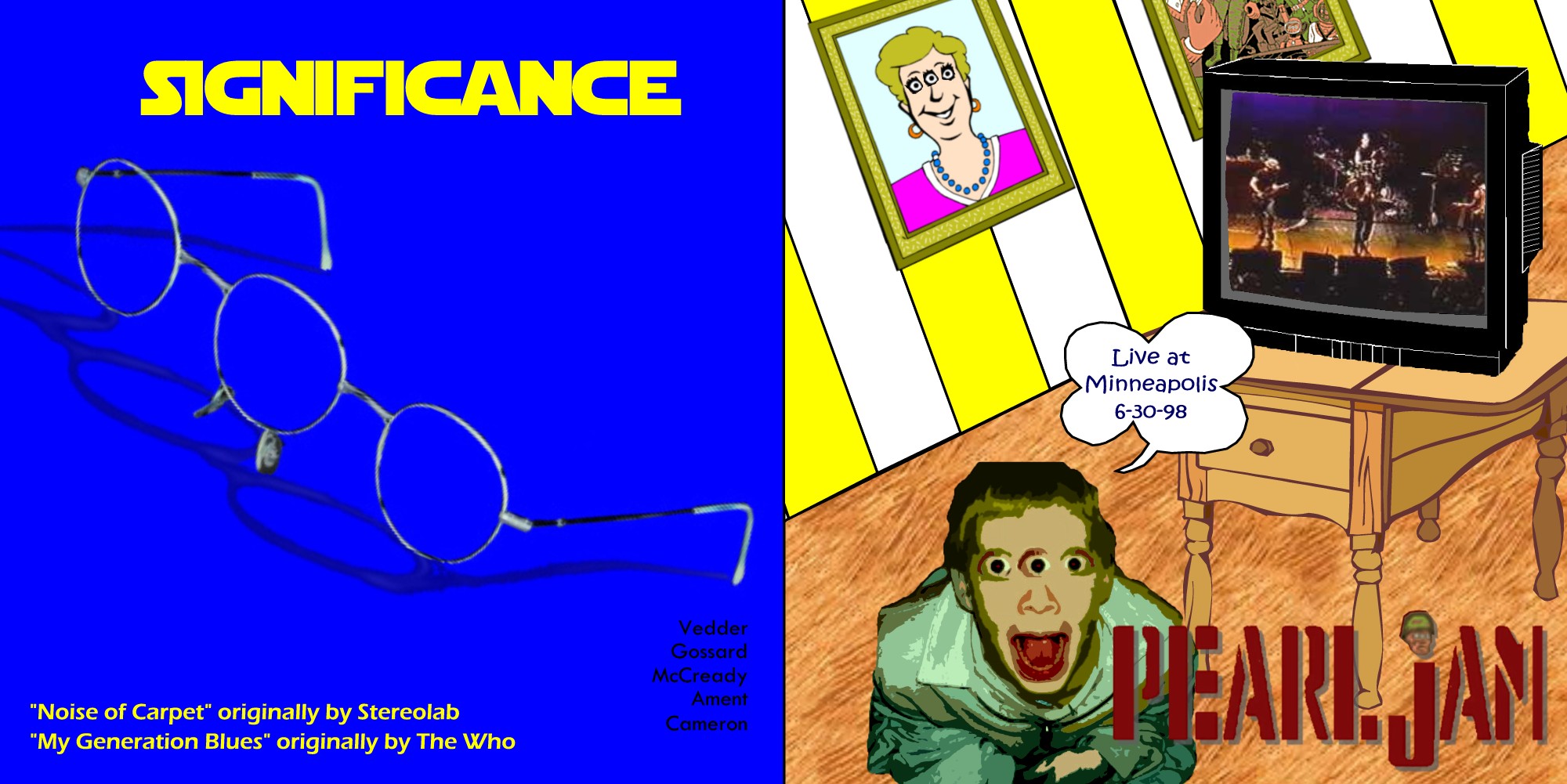
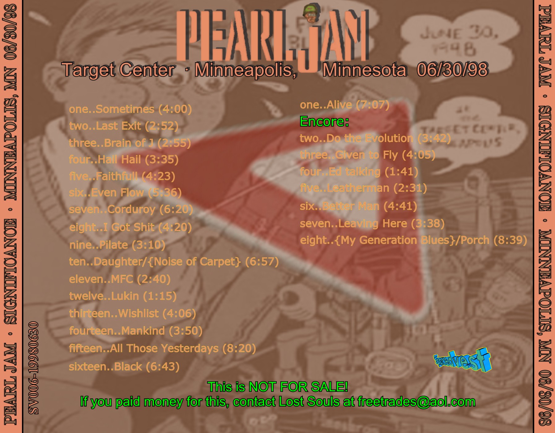
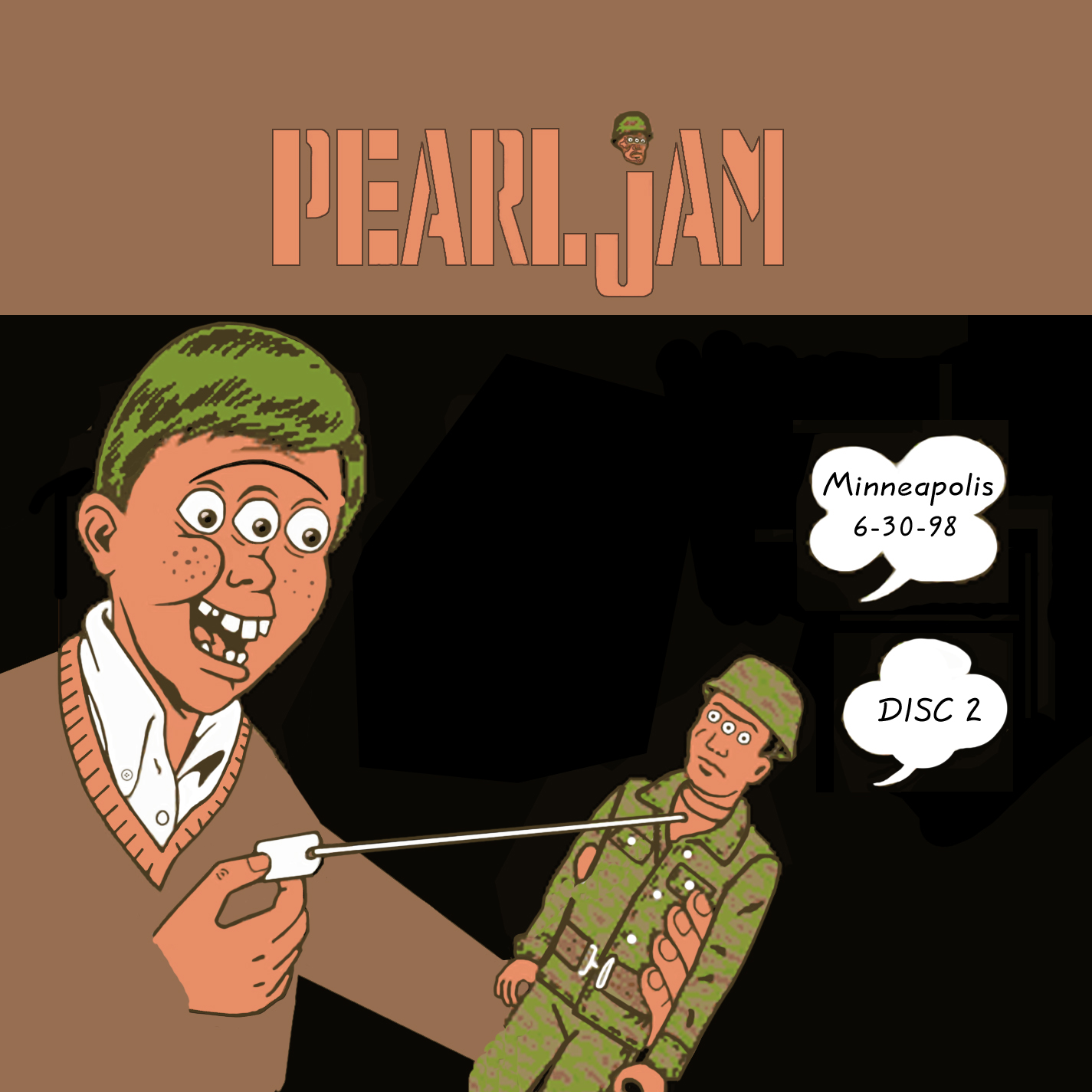
| 06/30/98 |
Minneapolis, MN |
"Significance" |
 300 dpi (340k) 300 dpi (340k) |
 300 dpi (336k) 300 dpi (336k) |
 300 dpi (451k) 300 dpi (451k) |
 300 dpi (552k) 300 dpi (552k) |
 300 dpi (552k) 300 dpi (552k) |
Comments: Again trying to incorporate Ward Sutton's Minneapolis poster, I wanted to take the three-eyes alien theme a step further. It probably is not too clear, but what I was trying to do was have the alien looking at the television look like
he is in shock and/or fear (he is watching Pearl Jam perform, which are horrific to him since they only have two eyes...note the irony). Anyway, not too clear, but oh well. The glasses were such a pain in the ass to make, I think I spent 20 hours on the glass frames alone.
Completed: Nov. 2001 |
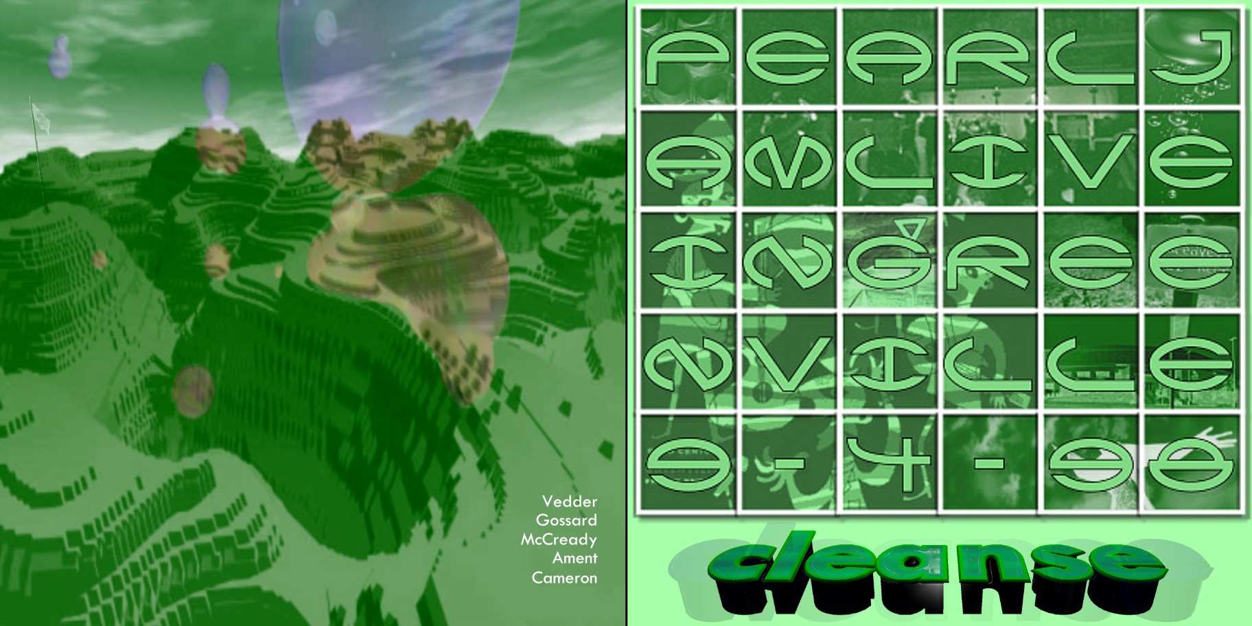
| 09/04/98 |
Greenville, SC |
"Cleanse" |
 300 dpi (342k) 300 dpi (342k) |
 300 dpi (255k) 300 dpi (255k) |
 300 dpi (287k) 300 dpi (287k) |
 300 dpi (74k) 300 dpi (74k) |
 300 dpi (74k) 300 dpi (74k) |
Comments: Since I was at this show and it was in nearby Greenville, SC (I live in Charlotte), I wanted to try and top myself and make something special. This one took so damn long to make...the cover of the insert alone took me at least 40 hours. A very painful process but I think I learned more modeling tricks, and I think it came it well in the end. The sound for this show is better than I remember being at the concert. This is also
the first one where I stopped having doubles of the track info (for both the tray and the back of the insert). Obviously this is harder, but this allowed more room for the cover.
Completed: Jun. 2001
Modified: Jan. 2002 (made the tracklisting on the tray a little better). |
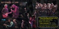
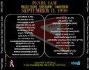
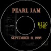
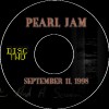
| 09/11/98 |
New York, NY |
"Three Years in New York City" |
 300 dpi (272k) 300 dpi (272k) |
 300 dpi (599k) 300 dpi (599k) |
 300 dpi (285k) 300 dpi (285k) |
 300 dpi (106k) 300 dpi (106k) |
 300 dpi (105k) 300 dpi (105k) |
Comments: This was another one that took me a long time to finish (about 10 months) after I started it. It basically is just a remembrance thing for the 9/11 victims, drawing upon the uncanny coincidence of the date. I am sure that event affected everyone the world over, and for me I kind of felt compelled to do this artwork (and a compilation cd I made of Ed called "Patriot" that I will probably never put up here).
Believe it or not, I had the worst problem with the back of the outside booklet (the part with the quotes). Everything I did I wasn't really thrilled with, until just going with the "simple" route with the meaningful quotes.
Completed: Aug. 2002
|
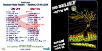
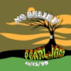
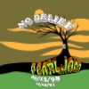
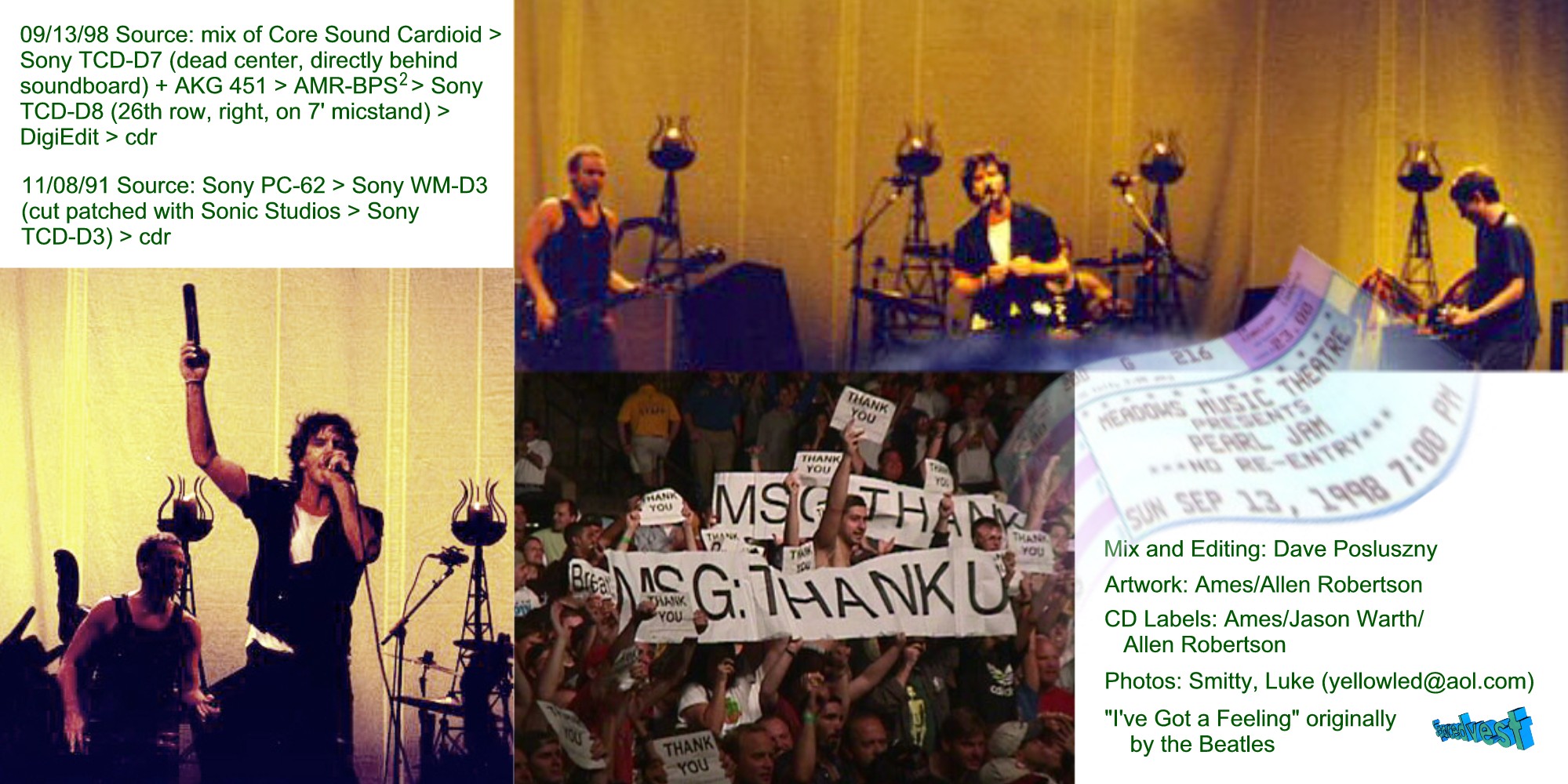
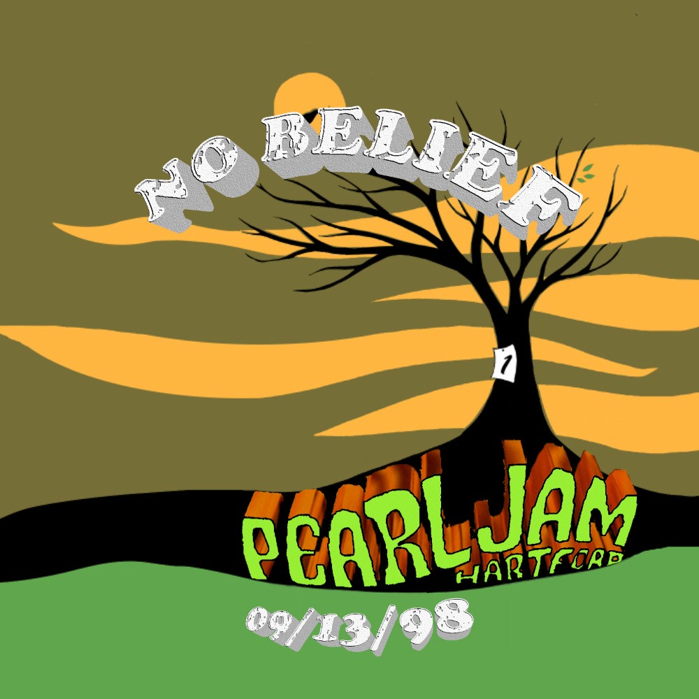
| 09/13/98 and 11/08/91 |
Hartford, CT and New York, NY |
"No Belief" |
 300 dpi (411k) 300 dpi (411k) |
 300 dpi (399k) 300 dpi (399k) |
 300 dpi (288k) 300 dpi (288k) |
 300 dpi (148k) 300 dpi (148k) |
 300 dpi (152k) 300 dpi (152k) |
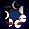
Comments: My "first" cd artwork since deciding to create these again. This one is very simplistic and didn't take long to do. I changed this a little, not really liking my initial attempt. I got the idea of overlaying the actual moon one night while driving home. :)
Completed: Mar. 2001
Modified: Jan. 2002 (totally resigned cd labels, improved the inside of insert a little with slightly better pics, and improved the tracklisting on the tray and the back of the insert). |
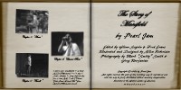
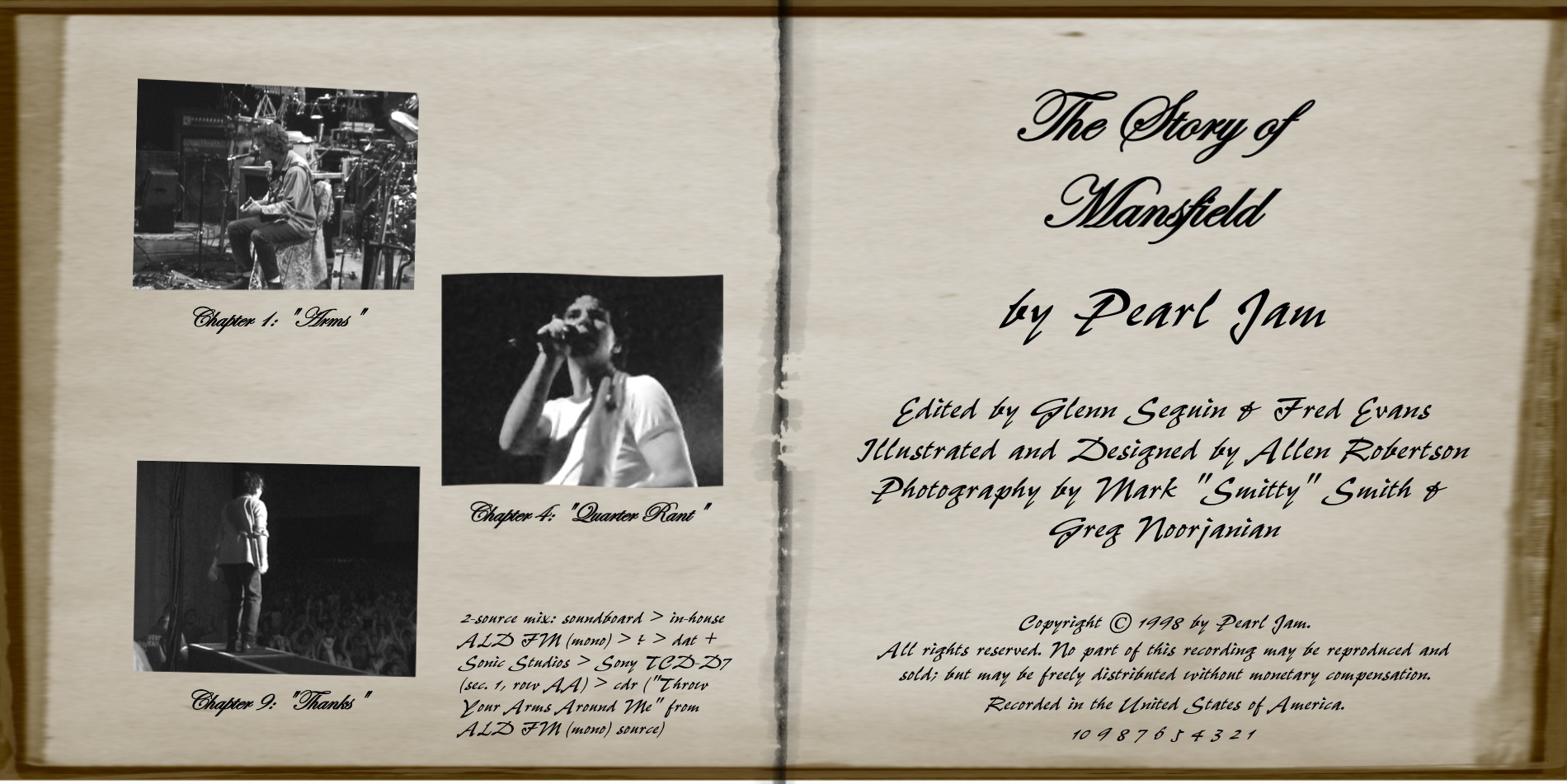
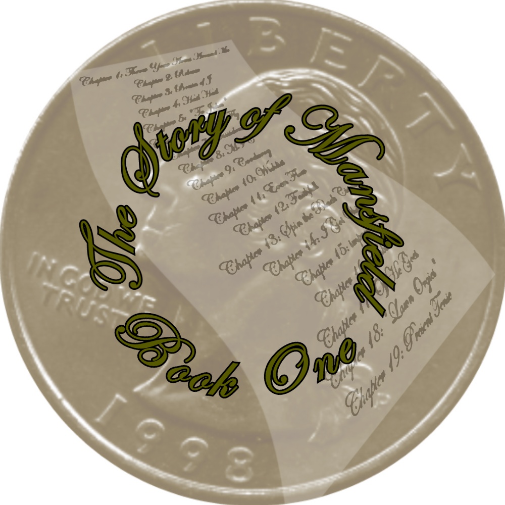
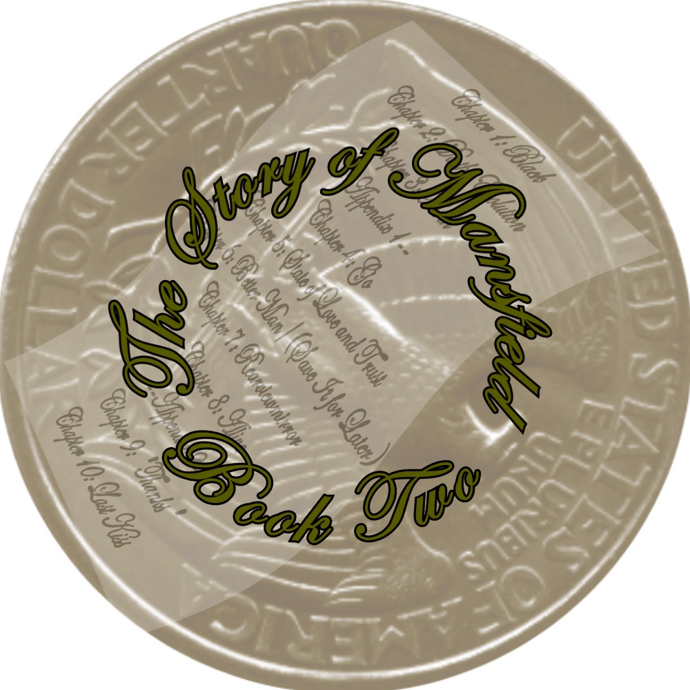
| 09/16/98 |
Mansfield, MA |
"The Story of Mansfield" |
 300 dpi (391k) 300 dpi (391k) |
 300 dpi (462k) 300 dpi (462k) |
 300 dpi (422k) 300 dpi (422k) |
 300 dpi (222k) 300 dpi (222k) |
 300 dpi (245k) 300 dpi (245k) |
 300 dpi (228k) 300 dpi (228k) |
Comments: After the last couple of cd art projects that I had done being so "model" oriented, I wanted to do something a little simpler. With Ed's several references to
"stories", I just turned this into a little book, and it should be kind of obvious where the quarter images are derived from. This is the first one that I did the inside of the tray for, and I will probably continue doing those for future shows. This looks best in a black (not clear) jewel-case.
I thought about maybe doing some things to make this a little better, but I lost most of the source files in my tragic "Harddisk Crash of 2002". :(
Completed: April 2002
|
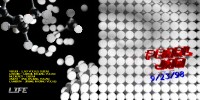
| 09/23/98 |
West Palm Beach, FL |
"Life" |
 300 dpi (529k) 300 dpi (529k) |
 300 dpi (609k) 300 dpi (609k) |
 300 dpi (461k) 300 dpi (461k) |
 300 dpi (167k) 300 dpi (167k) |
 300 dpi (171k) 300 dpi (171k) |
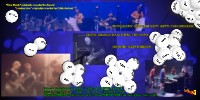
Comments: I really like how this one came out. Two notable things from the show was the ping-pong challenge and the references to Life (the improv and some of Ed's speeches). So basically I combined the two themes, turning
three-dimensional ping-pong balls into molecules and cells. The insert has the "family tree" of Pearl Jam being subdivided. I almost called this "Random Matrix Theory" (you can do a search on the internet for more information if you are so inclined), but thought
that "Life" was more to the point. I tried to point out the randomness aspect by using the random 0-1 combinations of the photography and on the cover. It should go without saying that Fred did a fantastic job on the audio end.
Completed: Mar. 2002
|